How to Respond to Mobile-Geddon

If you've heard of mobilegeddon, or read about it in an unnamed, very reliable and entertaining blog, then you understand that having a non-mobile site can hurt your visibility, and affect your business as we move forward toward an increasingly digital age. But don't worry. We have some tips for you to maneuver in this mobile-friendly marketplace to get back on top.
1. Stay Agile
As a small business owner, you might think that you got the short end of the stick on this update. Bigger firms are able to invest bigger money into their websites and SEO, and thus didn't have to deal with the same issues that you did, and were able to get out scot-free. But what you thought was your biggest slight, is actually one of your biggest advantages.
Being a "small business" means you are very lean, and flexible in your decision making process. If you want to institute a change, and go full-fledged on a responsive website, you have the ability to develop on your terms. You can apply any changes to your website much quicker, and have a greater ability to respond to the several updates that Google slowly rolls out (here, here, and here). If you decide to make a change, you have the ability to see if it's being effective more quickly than larger firms, and invest more or opt out depending on performance.
2. Do Your Homework
Although we are always in favor of a responsive website for User Experience and just overall convenience, we also understand there are other perspectives. Maybe no one using a mobile device goes to your website. Maybe they strictly view your website on a desktop. But, in order to know that, you have to actually look where your traffic is going. Whatever web platform you use (here's one that we swear by) should allow you to view your traffic, and you can compare your mobile and your desktop traffic to get a better understanding of where your customers are coming from.

Understanding how your customers reach you can help you better accommodate to their needs.
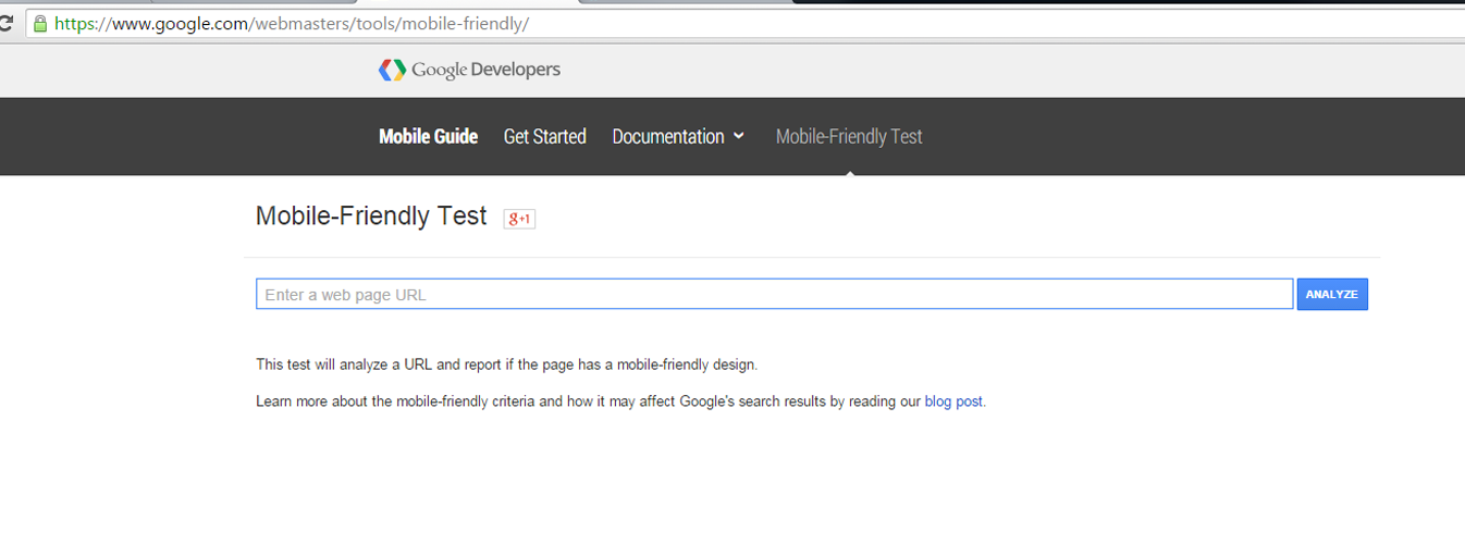
3. Assess the Damage
Analyzing your website through a mobile-friendly test can help you understand where your greatest areas of need are.
There may be some pages on your site that you didn't know weren't mobile friendly, and are bringing your overall rating down. Don't get brought down when you've invested in a "mobile-friendly website" when some of your supporting pages aren't mobile friendly. Once you've determined which pages, if any, are causing trouble, you can easily move to repairing your site.
Get Your Site 100% Mobile-Friendly! Contact 360 PSG Today!

