Psychology of Color
 When designing an ad campaign, one of the major considerations is deciding on what color palette (or color scheme) to use. It might be tempting to pick colors based on personal preference, but a smart business owner knows that there’s too much at stake in creating an engaging, user-friendly website to make such an important choice that way. Instead, they turn to the psychology of color to get better insight into which colors will work best for their brand.
Color theory
Before diving into the psychology of color, let’s take a moment to go over the basics of color theory.
-
Primary colors: Red, blue and yellow
-
Secondary colors: Green, purple and orange
-
Tertiary colors: Yellow-green, blue-purple, red-orange etc.
Primary colors are the colors we use to make all other color combinations. In traditional color theory, these colors are red, blue and yellow. In certain cases, primary colors may be different, such as cyan, magenta and yellow for color printers, and the use of red, blue and green in the device-dependent RGB color model used for displaying images on computers and other electronic systems.
However, to understand how color affects brand and sales, traditional color theory is all we need to worry about.
Secondary Colors
Secondary colors are made from primary colors. Red and yellow make orange; yellow and blue make green; and blue and red make purple. Tertiary colors involve combining colors in unequal amounts, which results in a color that leans more towards one of the primary colors than the other.
Pure Colors
All three of these color types—primary, secondary and tertiary—are called pure colors. The addition of white, black or gray creates even more options. The addition of white to a pure color results in a paler, less intense color, known as a tint, but is often referred to as a “pastel.”
When black is added to a pure color, the color—known as a shade—is darker and less vibrant than the original. When gray—inself a combination of black and white—is added to a pure color, the resulting tone drops down the original color quite a bit.
Choosing color
Now that you’re familiar with the terminology used in color theory, we can start to discuss how color affects marketing and sales. A University of Toronto study that investigated color compatibility discovered that people liked simple color combinations of no more than two or three colors. There are a few different ways to select those colors.
Complementary colors are those located opposite each other on the color wheel. For example, red and green are complementary colors. These colors help make things stand out, which is why you’ll often find complementary colors used in logos and insignias.
Once you’ve chosen your complementary colors, don’t use them in equal amounts! Aim for a seven-to-three ratio, using your main color for focus and your other color to highlight.
You have a few choices if you want to use three colors instead of just two. You can opt to use split complementary colors or the triangle approach. With split complementary colors, you’ll still select a single main color, but instead of choosing the exact opposite on the color wheel, you’ll use the colors on either side of the opposite.
So for example, instead of red and green, you’d end up with red and two other colors to use: yellow-green and blue-green.
Alternatively, you can use the triangle approach, and select three colors that are evenly spaced around the color wheel, like red, blue and yellow. You can also opt to use analogous colors, which are the three colors next to each other on the color wheel. This choice ensures that the colors are harmonious and don’t clash. Finally, you can choose a monochromatic palette, which relies on different tones, shades and tints of a single color.
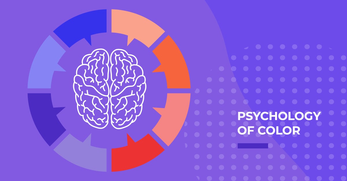
Color psychology
So now you know how to pair your colors, but we still need to address the most important part: how to pick your main color! While there is definitely some science to color choice, it is still part art form, because color can be extremely personal. There are however some basic attributes that colors evoke, and that you should keep in mind when selecting your main colors.
Red
Red creates a sense of urgency and encourages the appetite. It also stimulates the body in other ways, raising heart rate and blood pressure. Red is associated with excitement and passion, as well as movement.
Orange
As a mix of red and yellow, orange evokes both power and fun. As such, it is particularly good for brands representing physical health and comfort. It can also be a great motivator. However, in an overabundance, orange can also impart a sense of caution in viewers, so orange probably shouldn’t be the main color you choose, unless, say, you’re in the citrus fruit business!
Yellow
Yellow is the first color babies can see. It summons up feelings of happiness, and can elicit some of our most powerful emotional responses. As the color of the sun, yellow is joyous and celebratory.
But like orange, it shouldn’t be used too much. Yellow can cause people to become more critical and anxious, so it’s important to use just the right amount of yellow.
Green
Green is a harmonious, balanced color of growth and the environment. It is associated with stress reduction and overall health. Because it is also the color of money, it can have some minor negative connotations, such as materialism.
Still, generally, green is one of the most calming, peaceful colors you can use.
Blue
Blue is another soothing color. Additionally, it is the color of dependability and reliability. These attributes may help explain why blue is most people’s favorite color. In fact, according to research on color and gender, 57 percent of men identify blue as their favorite color, while 35 percent of women do. In large amounts, blue can come across as cold or unfriendly, but in the right amount, it communicates calm and trust, which are crucial in developing a relationship with potential customers.
Purple
A combination of the power of red and the calm of blue, purple evokes viewers' imaginative and spiritual sides. Long associated with royalty, the color is used to convey luxury, mystery and magic.
Pink
A softer and gentler version of red, pink soothes rather that stimulates. It communicates feelings of love and care, which is why it is often associated with romance and maternal figures.
Pink and blue have both been the subject of discussions about gender and stereotypes, especially about children, so make sure your use of pink doesn’t cement outmoded beliefs about men and women.
Brown
Brown is one of the least liked colors, but in the right situation, it can convey warmth and security. A “safe” color, it shouldn’t be overly relied on, but it can be a good choice for discussing serious matters, especially if black isn’t a good fit.
Black
In addition to connoting seriousness, black is the color of sophistication and independence. Unfortunately, it can also signify evil and death, so it is best used in small amounts to contrast and highlight.
White
The opposite of black, white signifies purity and innocence. As white is actually composed of all colors, its overwhelming attribute is equality. It can represent new beginnings and fresh starts, as well as simplicity and cleanliness. “White space” makes things easier to read and understand, but too much white can evoke feelings of isolation.
Color and your brand
Now that you know what colors elicit what reactions, it should be a little easier to pick the colors that work best for your business. With that said, the number one thing to keep in mind is that the colors you use must “fit’ with your brand. According to an article published in the journal Marketing Theory, color appropriateness “can bring inherent and immediate value to a brand.”
That is to say, does your color choice accurately reflect your brand? While brown may be considered a safe and even boring color, it is appropriate when selling chocolate or coffee. It is the most appropriate color for those particular items.
Orange may be an unpopular color (even though it elicits positive emotions), but you really can’t advertise your orange juice to moms by using purple (even if it is women’s second-favorite color). And there’s a reason 95 percent of political ads use red, white and blue. Anything else doesn’t seem to fit with the ideas of patriotism and service to country.
If your website isn’t using the right colors, you’re missing out on sales. According to the Institute for Color Research, it takes people just 90 seconds to form subconscious judgments about a person, environment, or object, and up to 90 percent of that judgment is based on color alone! Up to 85 percent of all consumer buying decisions are based on color, says online marketing guru Neil Patel.
Start Improving Your Brand's Design
If you want to make better use of the psychology of color, the web designers and digital marketers at 360 PSG are here to help! Our team can refresh your website or design social media ads to help capture a larger audience.
Contact us via our website to set up a virtual or in-person meeting to discuss updating your brand using these and other proven marketing strategies.