Featured News - Current News - Archived News - News Categories
11 Tips for Creating an Effective 'Call to Action'
by systemEvery website should have an objective it wants users to complete, whether it is filling in a contact form, signing up for a free trial, or making a donation. Assuming this is already in place, the next step is making sure users notice these elements and are then encouraged to act. The simplest method is through a highly visible "call to action" (CTA).

Whether in the form of hyperlinked text, a clickable button, image, or web form, the CTA is an essential website element that promotes visitor engagement, gives direction to users, and provides an avenue from which to measure the site's success.


Are your calls to action as compelling as they could be? If not, give 'em a boost with this checklist of tips for creating an effective CTA:
- Tell users what to expect. The first thing that you need to do is to determine what you want your visitors to do. What action(s) will they need to take? Will they need to complete multiple steps? Create a plan that communicates your intentions clearly to ensure there aren't any surprises.
- Offer a little extra. You catch more flies with honey, so it's natural that you may (on occasion) have to sweeten the deal to encourage users to complete a call to action. Incentives may include discounts, ebooks, sweepstakes entries, or free gifts.
- Keep it simple. There are instances when two or more calls to action on a page are appropriate, but most of the time, one will do the trick. If you force a user to choose between too many options, you may find that they choose none at all. Whenever possible, cut straight to the chase and give your viewers what they came for without forcing them to jump through hoops.
- Use active language to convey urgency. An effective CTA should encourage users to take an action right away. Words that encourage users to take an action include: call, buy, register, subscribe, view demo, and donate.
- Location, Location, Location! Another important factor is the placement of your call to action on the page. The old standby of making sure important elements are "above the fold," where subscribers and visitors can see it without having to scroll down holds some weight, but the main goal is to make sure your CTA is easily found and not competing with other elements on the page. Proper placement can lead to higher click through rates and more conversions.
- Be thoughtful with your white space. Surrounding your call to action with whitespace ensures that it will stand out as an important element, and increase the likelihood of engagement. If the page is too cluttered, it's possible your CTA will become part of the noise.
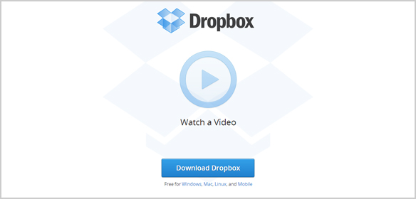
- Be Bold. Draw visitors directly to your call to action with a sizeable, colorful button in a shade that contrasts with the background of your site. Do not use colors that will blend-in with the main design. Let it stand out.
- Optimize for SEO. You should always take every opportunity to enhance your on-page SEO. By adding a keyword-rich <img> alt attribute to your button or graphic, you're providing search engines with information they need to associate the page with your desired search terms.
- Include a call to action on every page. Calls to action are not just limited to the homepage. Every page of your site should have some form of a CTA that leads the user through your site. However, not every CTA needs to be the same for each page. Instead you can use smaller actions that lead the user towards your ultimate goal.
- Consider an alternative. Some users just aren't ready to commit to your primary goal. In this case it's useful to provide an alternative where they can learn more about your product or service. This call to action should have less emphasis and not steal any glory from your primary, but clear enough that users can make the choice if necessary. An example might be a "Buy Now" as your primary and a "View Demo" as your secondary.
- See what works best. The best way to know if a call to action will be effective at driving traffic to your landing pages is to test a few different options. You can often significantly improve click-through results by making simple design changes such as color, text, and size of button. However, until you test your CTA, there's no way of knowing whether you have chosen the best option.
In Summary
Effective calls to action are the key to a successful website and evolve from a combination of best practice in design, usability, and engaging copywriting. When done right CTAs can develop new sales leads, increase conversion rates, and generate an overall measurable return on investment. For more information on adding a custom CTA to your site or CTA goal tracking, contact a 360 PSG Account Manager at www.360psg.com.


